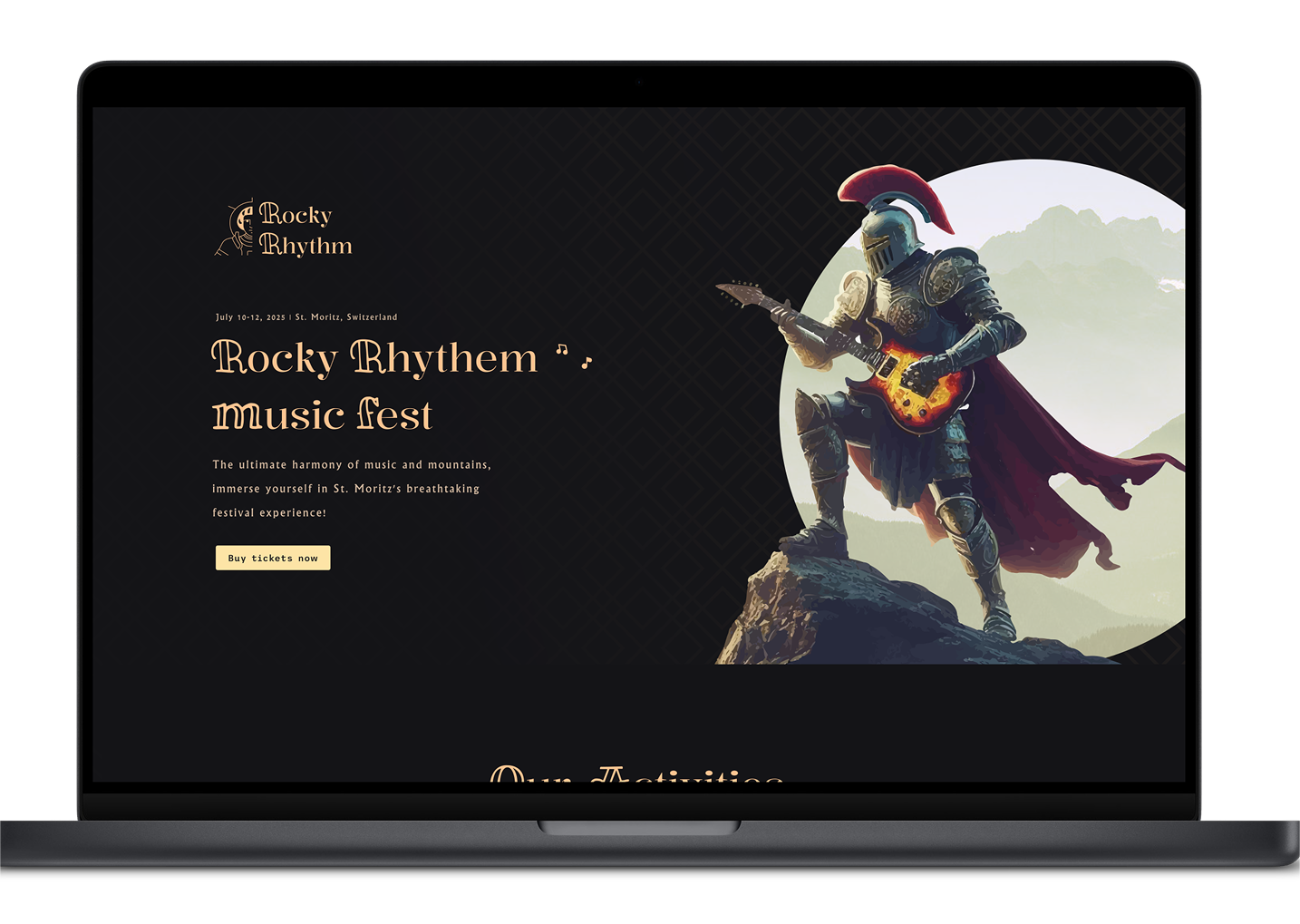
Case Study

Rocky Rhythem

The concept

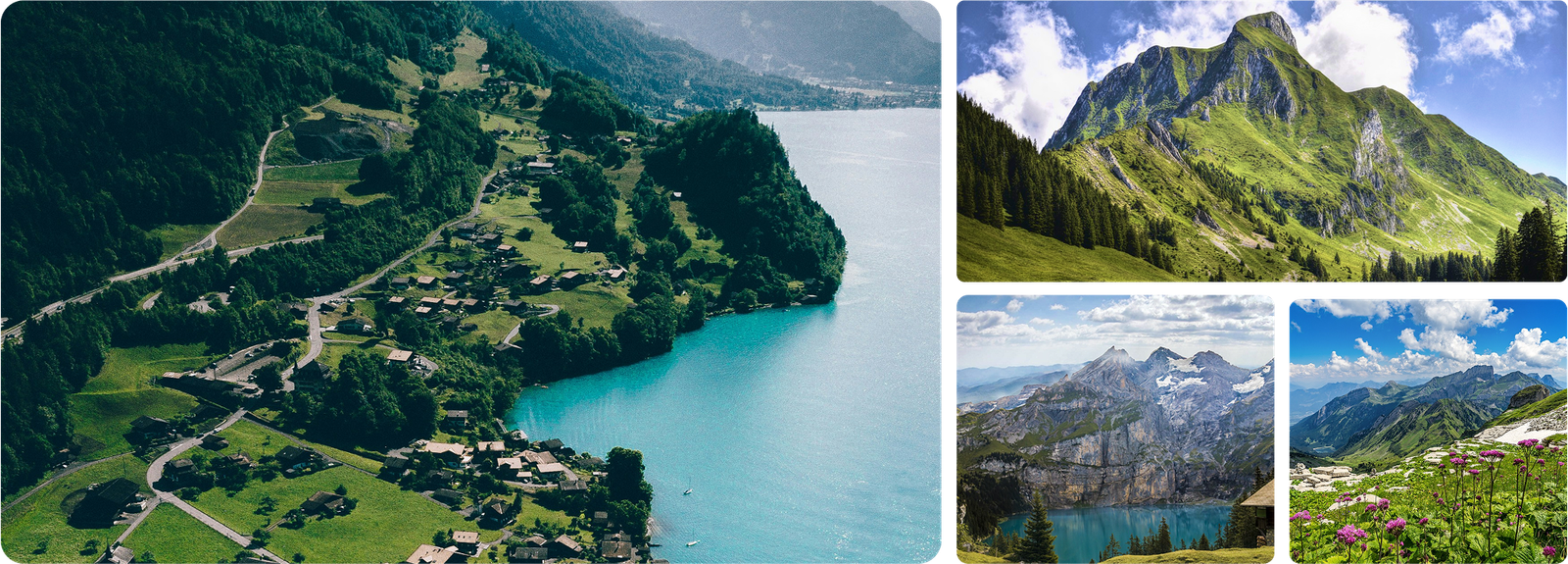
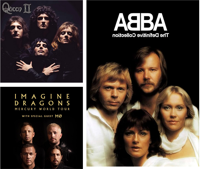
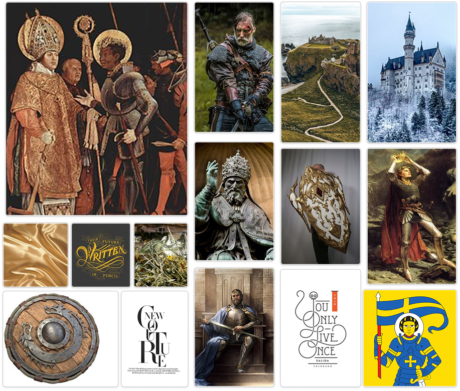
For this project, the goal was to create branding for a music festival of our choice. I chose a Pop Rock Music Festival, as it's one of my favorite genres and offers a dynamic, energetic visual direction. I imagined the festival taking place in Switzerland, blending stunning landscapes with the vibrant atmosphere of pop rock.

The Location

St.Moritz, Graubunden Canyon Switzerland

Music Genre

Pop Rock

Pop rock music is the intersection of mainstream pop music with rock music, which is often driven by guitars and drums. The term "pop" can refer to all sorts of popular music

MoodBoard

Icon concept

I wanted to go with a simple design featuring St. Moritz as the main concept, with half of its face on the left and the name of the music festival on the right, using typography of my choosing. using this design at the end.

I tried using a more complex design, incorporating many brainstorm concepts such as the shield, St. Moritz himself, and more. I decided that a simpler design would better align with my vision.

Style Guides

Color

Typography

Elements

Full Page

Made with